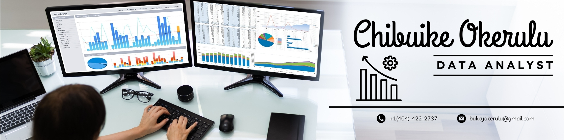
Introduction
👋 Who I Am
My name is Chibuike Okerulu. I studied Psychology at university, drawn to understanding how people think, make decisions, and behave. While my classmates focused on case studies and research papers, I found myself increasingly interested in technology. What began as simple curiosity grew into a passion. I taught myself how to code, starting with HTML, then CSS, and eventually JavaScript. I spent countless hours experimenting and building websites from the ground up, which led me to work as a freelance web developer. I found it incredibly rewarding to see ideas take shape through code. Over time, I realized that what I enjoyed most was not just the coding itself, but the problem-solving, the logic, and the underlying patterns. I became fascinated by how data could be used to uncover insights and support real-world decision-making. This realization guided me toward data analytics, a space where I could merge my understanding of human behavior with technology to solve meaningful problems.
One person who played a major role in shaping my journey is Alex The Analyst. Over the past few years, watching his tutorials and listening to his clear and honest advice opened my eyes to the world of data. His content made analytics feel accessible rather than intimidating. He spoke not just about dashboards and SQL queries, but also about real career paths, skill development, and building confidence. Whenever I felt stuck or unsure, his channel reminded me that learning data is a process and that I am not alone in it. So when I discovered that he had released a public dataset from his audience, the global "Data Professional Survey," I knew I had to dive in and explore it.
This wasn’t just any spreadsheet. It was a survey of 630 people working in data, collected and shared by Alex The Analyst himself. The questions were exactly the kind I had swirling in my head:
"This isn’t a business case study. You won’t find sales dashboards or stakeholder reports. Instead, this is a deeply personal project."
It’s my attempt to:
I’ll be using:
🧭 What’s Coming Next
In this project, I’ll explore:
I’m not trying to impress anyone. I’m trying to connect, to learn, and to grow. This is my story, told through data from people like me, people who chose this field, sometimes against the odds, because they believed in the power of data to change lives.
📦 Source of the Dataset
This dataset was collected and shared by Alex Freberg, better known as Alex The Analyst, a respected data analyst and YouTuber known for making data careers more accessible to learners around the world. In one of his community engagement efforts, Alex released a dataset titled the "Data Professional Survey". It consists of responses from 630 people working in various data-related roles across the globe.
These individuals answered questions about:
"The survey provides a rare glimpse into the real people behind the data industry—not just job titles or income figures, but experiences, values, and challenges."
🎯 What I’m Doing With the Data
This project is not a business analysis. I won’t be calculating sales trends or customer churn. Instead, I’m using this dataset as a personal mirror—a way to:
Specifically, I’ll be:
🛠️ Tools Used: Python (Pandas, Jupyter Notebook) – for cleaning, MYSQL and Power BI for exploration, Power BI – for interactive dashboard creation, google docs – for documentation and storytelling
I grabbed this dataset from the Data Professional Survey. Shoutout to Alex The Analyst for consistently sharing valuable insights.
For any data enthusiast like me who is stuck learning Python, pandas, SQL, Excel, Power BI, or cloud-based platforms, I promise that if you search for Alex The Analyst on YouTube, a lot will start making sense. That, and of course, consistent practice. Don't get stuck in tutorial limbo. It’s no fun.
At first glance, the dataset had a lot of information I didn’t need: email addresses, timestamps, browser types. I’m not building a CRM, so I cleaned house and removed them. Then came the real work. I checked for missing values because, let’s be honest, no dataset comes perfect. For numerical columns, I used the median to fill in blanks. It felt like the safest choice, avoiding the pull of outliers. For education level, I filled in missing values with the most common response, reasoning that the majority view offers a sensible default. Now, the salary column was another story. Some entries looked like "50k" or "225+." I stripped out the "k" and treated the "+" entries as flat numbers. Not perfect, but good enough for the kind of analysis I was doing. I just wanted a general sense of income levels, not a precise financial report. Along the way, I kept scanning for any nulls I might have missed. Two sneaky ones — index 379 and 454 — slipped through, but I caught them and filled them manually to stay consistent with the rest of my approach. In the end, I wanted a dataset that wouldn't fight me. I needed something clean, consistent, and ready to help answer the big question: Why did I, and people like me, decide to move into data? To view the full cleaning process, click here. I know the code is a bit messy, but don’t judge. I was jamming to Nasty C and it was 2 a.m. on a Wednesday morning.
🧾 Why I Wrote SQL for This Project
So I’m cleaning up this dataset, minding my business, when I scroll past someone’s answer to the “Favorite Programming Language” question, and they straight-up said SQL isn’t a language. That was the moment I knew I had to write SQL for this project. I don’t care what anyone says. SQL is a language. Maybe it doesn’t build video games or automate your fridge, but it talks to data. And that’s enough for me. Honestly, it’s one of my favorites. There’s just something satisfying about running a clean GROUP BY and seeing the story unfold in rows. The queries I wrote weren’t just to crunch numbers. They were part of me figuring out my own story. I wanted to know: Who else switched careers? Are we happier now? Do we make more? Do we still cry in Excel sometimes? SQL helped me answer that. So suck it Participant no 23 😝.
🧠 SQL Ambitions (Plot Twist)
At first, I wrote out some beautiful SQL queries, declarative, efficient, poetic even, but... turns out, my SQL outputs weren’t connected. See, at the point of me writing the SQL and trying to prove a point, I forgot to add a common field like "RespondentID", "YES I KNOW A ROOKIE MISTAKE", and I had given myself a set amount of time to finish this project, so I couldn't go back to begin fixing it from the cleaning process because I was already short on time, so the visual interactions fell flat. So I made a decision: 🔄 Fallback to Power BI’s DAX and model design, letting Python handle the prep. You win this round, Participant 23, the one who claimed SQL "wasn’t a language." But don’t celebrate too hard... ⚔️ I’ll be back with a dedicated SQL-based analysis project using a similar dataset. Just to prove a point.
📊 Why I Built This in Power BI
Once I cleaned the data and asked my questions with SQL, I knew I had to see the answers, not just in tables, but in something visual and scrollable. So I fired up Power BI. This dashboard isn’t just charts for the sake of charts. It’s me trying to see the bigger picture:
I used Power BI to bring the story to life. I wanted to interact with the data, test a few hunches, and maybe confirm that I’m not the only one who left another field chasing something better. You’ll find filters, comparisons, and a few visuals that helped me answer the questions I started with, and maybe even ask better ones along the way.
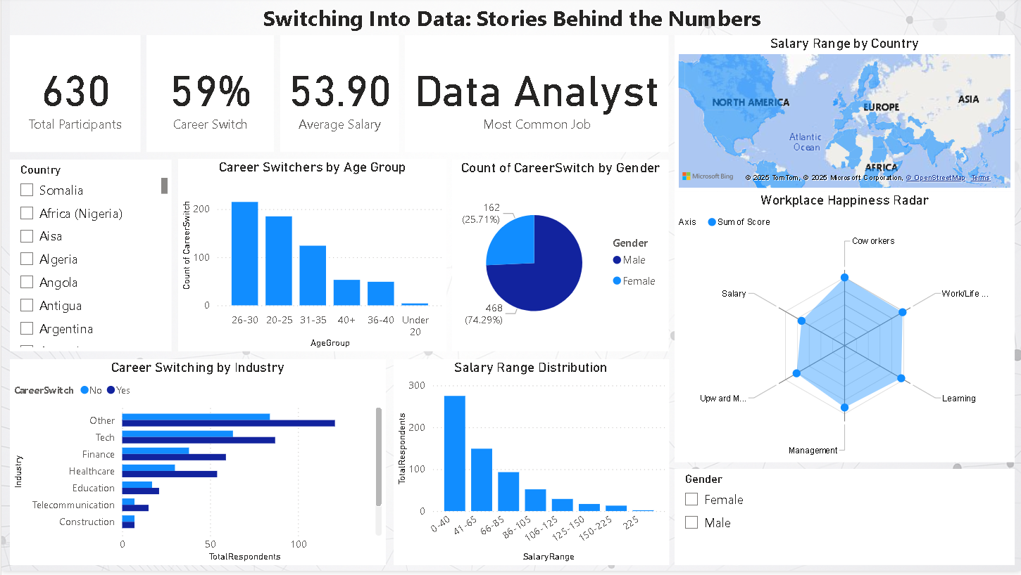
📊 Dashboard Walkthrough — The Part Where It All Comes Together
To interact with the dashboard, CLICK ME
This dashboard isn't just a bunch of charts. It's a visual story of my little dive into the world of data folks. I didn’t just want to clean the data and call it a day. I wanted to see myself in it, and maybe help others see themselves too. Here's how each part of the dashboard plays its role:
These were my “starter pack” stats:
These cards do what a good intro does — they answer the first questions before anyone even asks.
📈 Career Switching by Age Group — The Real Movement
This visual’s doing a lot more than showing bars. It’s telling the story of when people decide to bet on themselves. Most switches happen between the ages of 20 and 30, which honestly made me sit back and smile, because I switched at 25. I'm 27 now, so seeing that spike in this age group was like "yep, that was me." There’s a drop-off as people get older, maybe it's about comfort zones, maybe fewer chances, or maybe just life doing its thing. But this chart? It’s a timeline of bravery. It shows when people decided to rewrite their careers, pick up new skills, and start fresh in a whole new space. And in a weird way, it made me ask myself: "Was I early? Late? Or exactly where I needed to be?" Turns out, there’s no perfect age, but there’s definitely a pattern, and it’s one I’m proudly a part of.
🧩 Career Switching by Industry — Where Are We Coming From?
This one’s fun because it shows what people were doing before they entered data. “Other” is suspiciously high (people really didn’t want to say 😅). Tech, Finance, and Healthcare are popular pipelines. It’s a reminder that the path in is rarely straight, and it’s okay if yours isn’t either.
🌍 Salary Range by Country — Money Meets Map
I threw in a map because we all secretly love maps. It breaks down salary ranges across countries, which gives you a feel for what data roles pay globally. It's not perfect, but it starts the conversation.
🍰 Career Switch by Gender — Quick Pulse Check
This little pie chart shows how many women vs. men made the switch. It’s clean, it’s clickable, and it pairs really well with slicers to see deeper stories by gender. Think: Where are women switching from? What are their average salaries?
📊 Salary Range Distribution — What Are We Really Making?
This one hit me the hardest. Most people fall into the lower salary bands, especially those early in their careers or just switching in. It’s honest. It’s humbling. And it’s helpful.
🧠 Workplace Happiness Radar — The Feelings Chart
This radar chart breaks down: Satisfaction with salary, work-life, coworkers, management, mobility, and learning. It’s built off a separate table because unpivoting in Power BI was a journey of its own. But hey, I got it to work. It tells you where people feel good, and where they’re maybe just quiet-quitting in peace.
🎛️ Slicers — Choose Your Own Adventure
Want to see how things look just for Nigeria? Or only for women in healthcare? Boom, slicers. Everything responds (except the radar chart, which is a bit moody). It turns the dashboard into a tool, not just a presentation.
🧠 Final Thoughts
This dashboard helped me take a step back and say: “Yo, I’m part of this story now.” It made the switch into data feel less like a shot in the dark and more like joining a movement. And best believe, I’m not done yet.
© . All rights reserved by Buike.